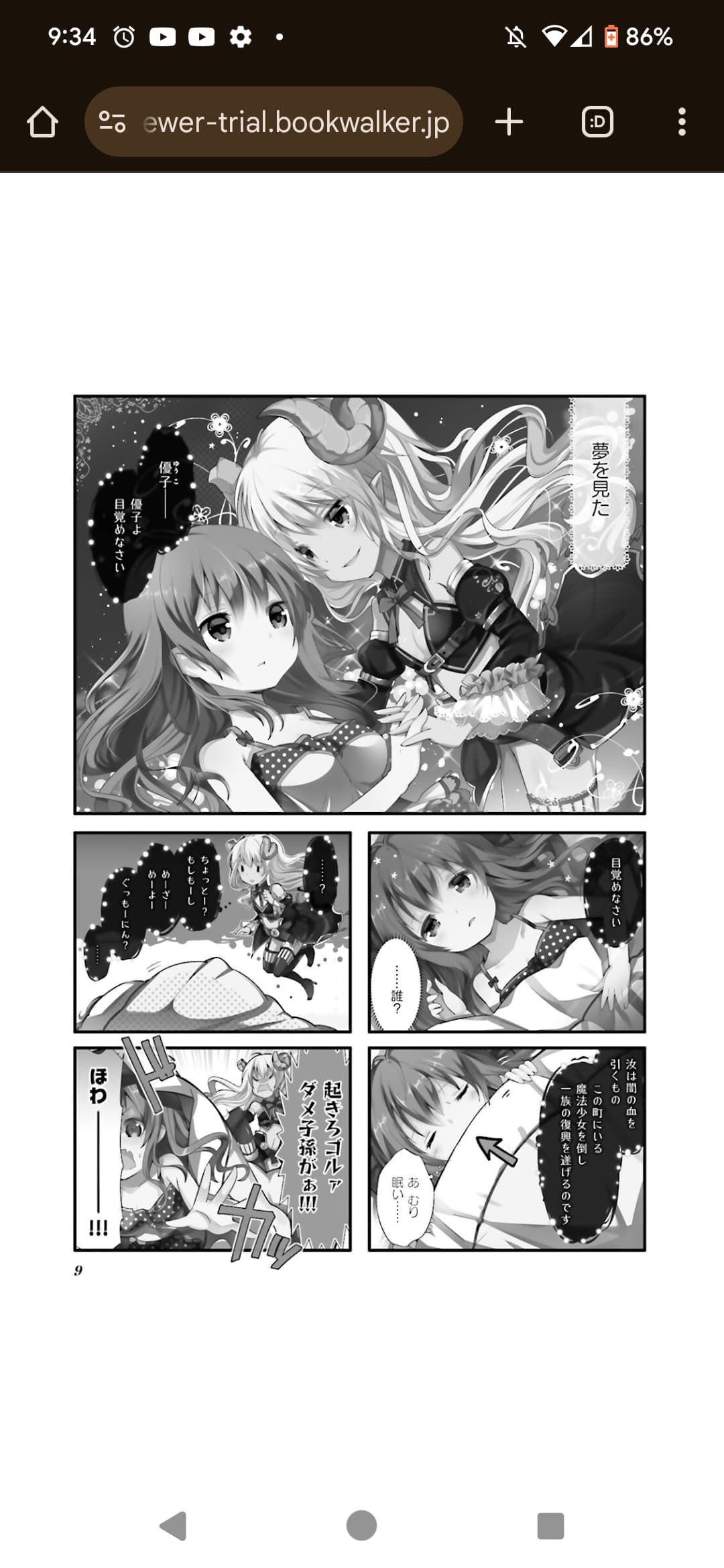
If I remember correctly, it’s the black and white pages that are bad, but I could be wrong.
I’m looking at まちカドまぞく on ComicFuz and btwn that and the Kindle app version, I do notice some loss in color contrast, with the darker colors
comparison screenshots - color & B&W
Color page:
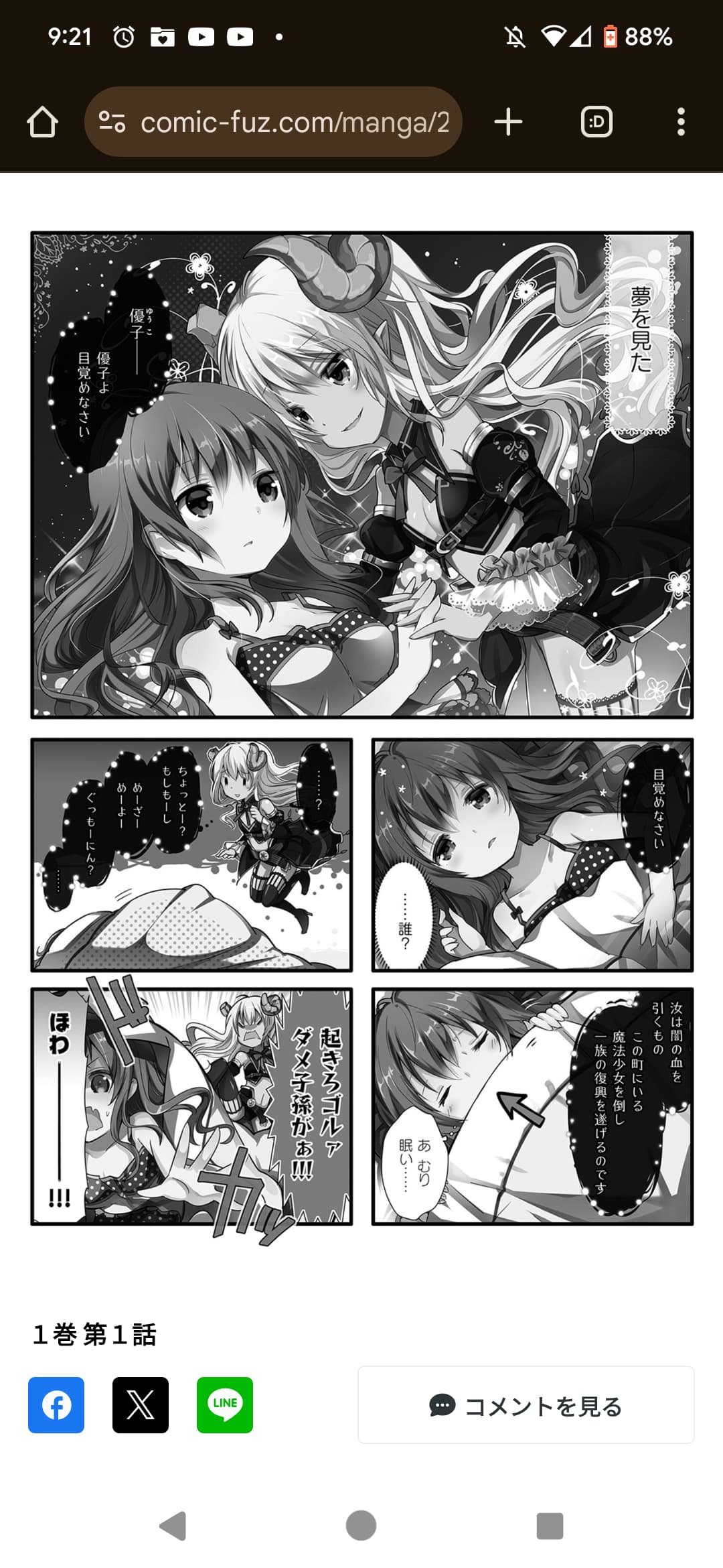
Interestingly the dark text box in the top panel is translucent in the Kindle app version. I’m guessing the online version here (ComicFuz) is pre-tankobon
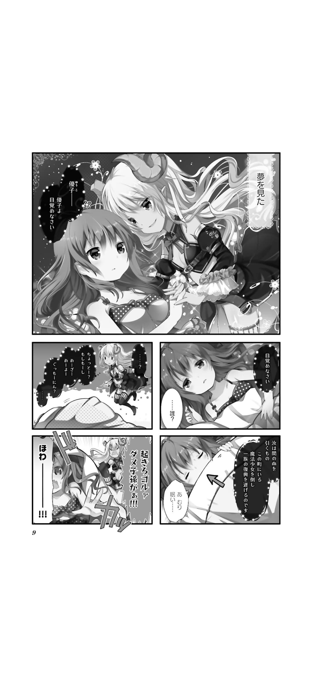
Black & White:

Black and white:
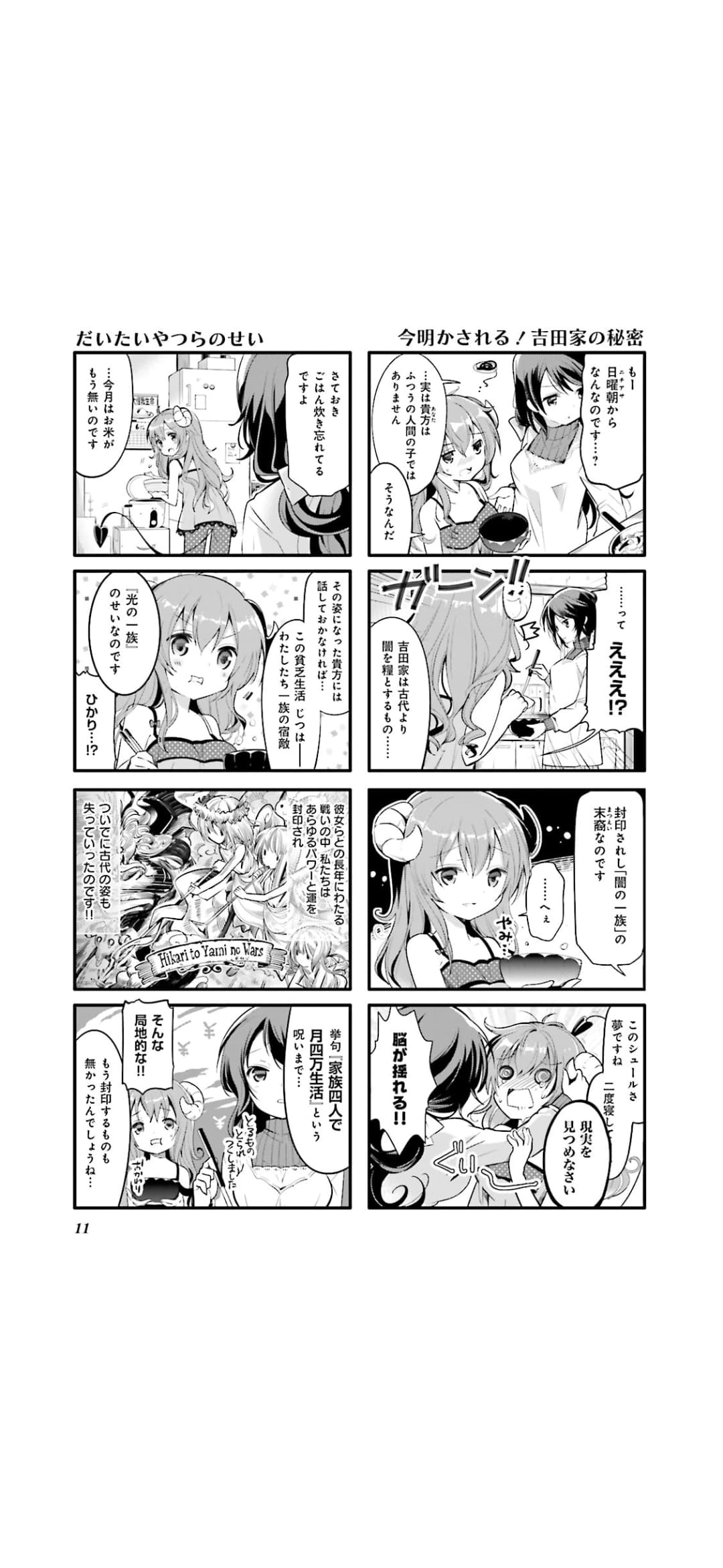
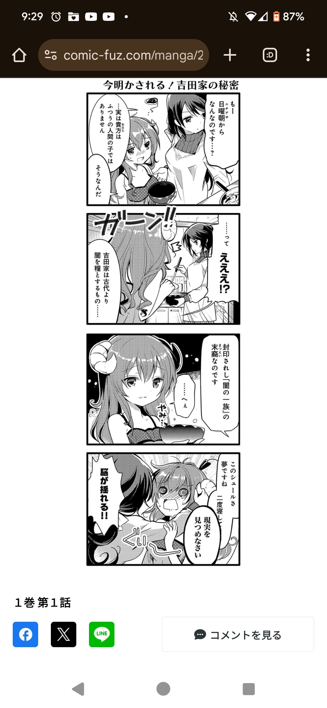

Artistically I’d definitely go with the web version, based on these. Bookwalker looks identical to Kindle app to me
1 Like
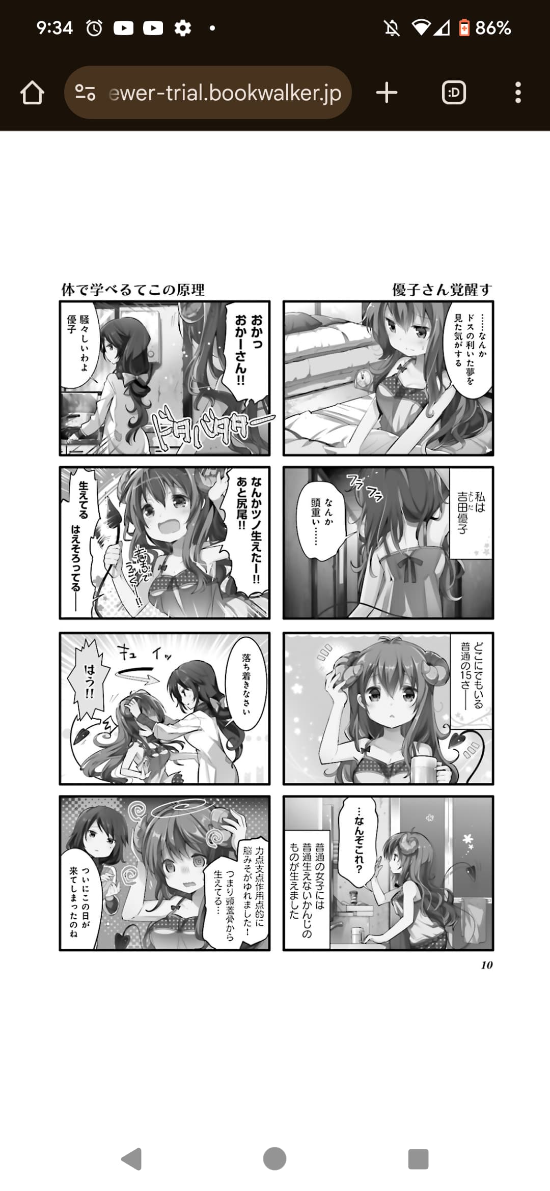
I think the bottom left panel of page 10 shows it pretty well. It’s not as bad as I remembered, but it’s still not great. Even the character models look a bit smudged. The Comic Fuz online version you posted looks much crisper and more in line with my physical copy.
2 Likes
