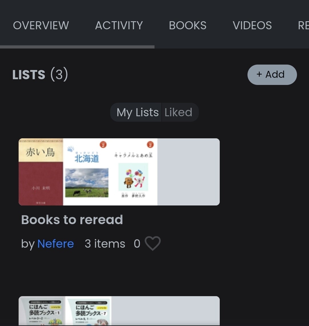
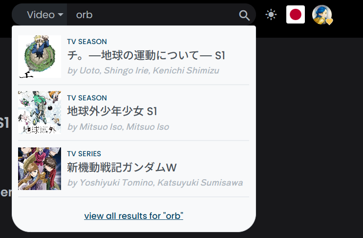
If you find any blindingly bright UI elements while using dark mode, post them in this topic. Mention what page(s) it happens on and include a screenshot if possible. If your problem is with the new dashboard post here instead, but otherwise use this topic.
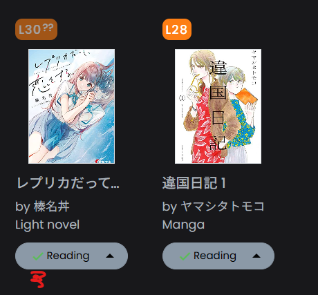
On the profile overview page, the green checkmark is nearly impossible to see on the grey background. This is also found on other pages like the popular books page if you’ve read anything shown there.
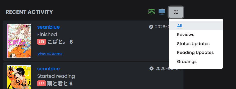
On the profile activity page, this menu is white.
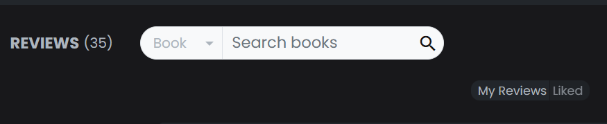
On the profile reviews page, this search box is white.
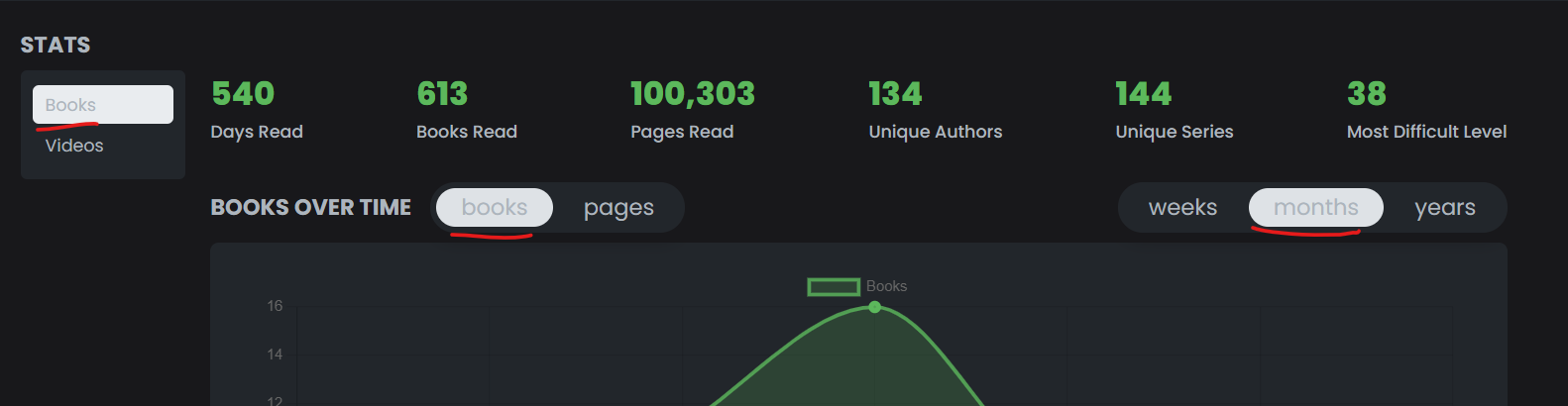
On the profile stats page, the text to background contrast is really bad on these selected menu items.
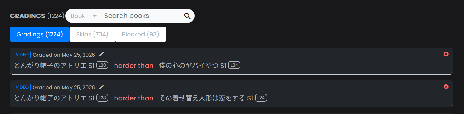
On the profile gradings page, the search and non-selected menu items are white and have bad contrast.
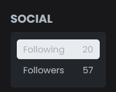
On the profile social page there’s also some bad contrast.
On the browse/search page, the contrast in this dropdown can be improved.
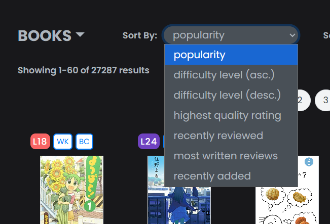
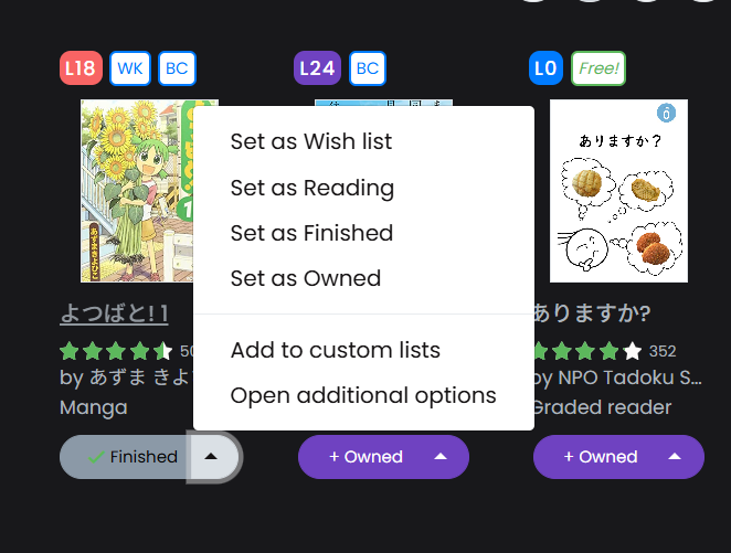
On any page where this is available (e.g. specific book page, search page), this menu is white.
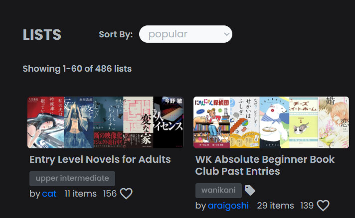
On the lists page, this search box is white.
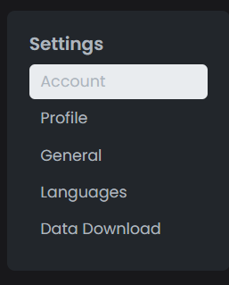
On the settings account page, the selected menu item is white and has bad contrast.
On the settings profile page, the drag and drop space could probably be made darker.