With the latest .csv data dump up and running, I thought it’d be fun to share some tips for data visualisation, as well as ask more generally what graphs people want to see/have made, and how useful they find the information.
Disclaimer: I am a data and coding baby and don’t really know how to automate any of these things that well, so this is just how I do things. If you know of better ways, please share them! We will all benefit! Especially if you know how to automate this!!!
Even more importantly, if I’ve introduced any errors through this method, please let me know immediately so I can fix them up. I also don’t know yet how scalable these are since I only have less than a year of data to go on, so maybe some of our longer-term members might have some views on that account.
Visualising Natively data - Google Sheets Template
My graphs so far
So far I’ve made 4 types of graphs based only on the basic data level (I have not yet looked at reading session data, and I don’t record my watch data). They are: Min-Max-Avg natively levels over time, Count by Levels over Time, Count by Type over Time, and Cumulative Count over Time. They look like this:
Charts

This one is really great for seeing improvement over time! Of course, it’s not the be all and end all, but it’s nice seeing the average level climb for a beginner like myself.


I like these two as an easy visual to see how my months went.


Less useful for me right now as I mostly read manga, but will be nice to see what my mix is like in the future as I hopefully pick up longer-form reads.


This one’s just an ego-stoker - it can only ever go up!
Making the graphs
You can probably use a variety of software to make the graphs, but my preferred method is Google Sheets mainly because I can access it online fairly easily from multiple terminals. Here is a template I’ve made; I’ve also replicated this link above for easier access.
Here’s how I grabbed the data and set these ones up:
Data prep for visualisation
Basic data cleaning
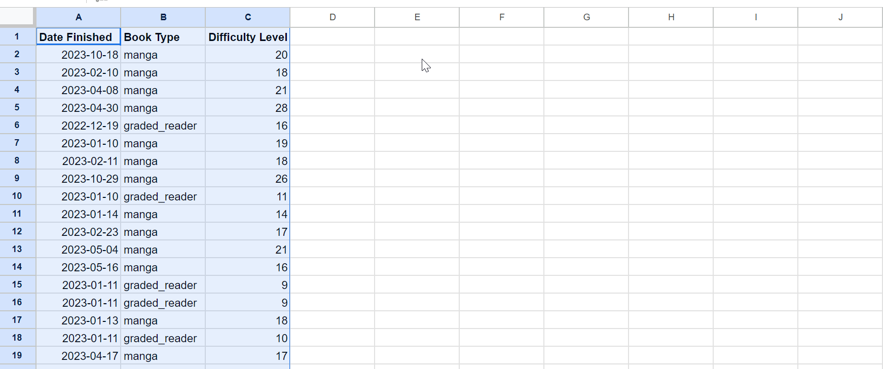
The first thing to do is get the CSV into a usable form. For this lot, we just want User Books. First grab the CSV from >Settings>Data download on Natively:

Generate it, click on the .csv link and save it to a location. Then load it up in your spreadsheet editor of choice. For Google sheets, that’s making a new sheet then from the top menu going to file>import>upload and selecting it.

At this stage it should look something like this.
The above graphs only really are looking at the Natively ratings and their associated dates, so that’s all we really need to keep – as long as each entry is maintained relative to the dates, everything should work out. I’m going to separate them out to work on them more cleanly.
First step - reorganise the data to move my finished books to the top. First I’ll freeze and bold the 1st row for organisational purposes…

Then select the Status column and we’ll sort A-Z.

Now let’s separate out every Finished entry. For the above graphs we’ll only need three columns: Date finished, Book type and Difficulty level. (I’m not sure if date finished or date finished (raw) are better, but I’m just going for date finished here). Start a new page on the spreadsheet and copy those columns over, preserving the current sort order.
The new page button is the plus sign at the bottom right.
Then delete everything that isn’t finished, and freeze the first row again. (You can tell when each entry is not finished because the date finished column will have no further entries - of course, you could cull the data before you copy it to the new sheet. Whatever you want to do).

Everything from here down is in-progress, stopped or wish list entries, so you can just delete them.
Adding dates in machine-readable format
I think the easiest way to make the graphs I want is to split the month and year data out from the date column (that is, each entry will get a ‘month’ and a ‘year’ value). Doing this is easy enough: we’ll make two new columns, labelled Year and Month in column D and E…

Then in cell D2, enter: =year(A2). Meanwhile, E3 gets =month(A2). These will read column A as a date format and split the year and month out into their own columns respectively.

Then copy the formulas into all the cells below each. Google Sheets will suggest an autofill, which will work, or you can click and drag it down or just mass copy-paste it to all the cells.


(It’s not really necessary, but at this point you might want to resort the data by date finished as well).

Setting up rows for each unique year-month entry
Before we can get to the actual fun bit, first, we’ll set up our Unique Year and Unique Month data columns so we can use that to establish our formulas to grab various bits and bobs later.
Yours will vary depending on your date range, but I just need from Dec 2022 (my earliest entry) to Nov 2023 (the present). You can just set this up manually like this:

For convenience’s sake, we’ll also set up something to show the date next to it. As I am sorting this data by year-month, we’ll just set it to the first of each relevant year-month and just hide the way it displays it.
Set up a new ‘date’ column, and in the first cel, enter this formula: =date(G2,H2,1)
[in english: set cell G2 as the ‘year’, cell H2 as the ‘year’ and ‘1’ as the ‘day’ for a new date]
Then replicate it down.

Let’s make the date present more human-readable. Select the date column and go to format>number>custom date and time.

The default of "Year - Month (in 3 letter format) should be sufficient, so just click that.

Phew! We’re finally ready… to start graphing!

Actually graphing
Making the min-max-avg graph
Let’s start with the min-max-average graph. First thing we’ll do is, we’ll make three columns to contain our data: Min, Max, and Average.

Next, in the first cell for the Min column, let’s put in: =MINIFS($C:$C,$D:$D,$G2,$E:$E,$H2) and replicate it down.
(If you’re wondering about the $s, the marker indicates to sheets that each pointer is an absolute reference and shouldn’t change if you copy the formula over to another column. This will come in handy in a second. Note that I’ve only ‘frozen’ the column pointers; the rows [number entries] do need to change as we replicate them down the rows.)

It’s worth breaking down what this formula actually does. Basically, it is pulling out the minimum value from within a data range based on a number of additional criteria.
In this case, the first argument (bit before the comma) is the dataset to check ($C:$C = column C, or Difficulty Level); the second argument the first criteria to check against argument 3 (or in English: does the Year entry in column D match the UniqueYear entry in column G?) and the fourth and fifth arguments the same for month (does Month entry in column E match the UniqueMonth entry in Column H).
So this formula is asking: what is the lowest difficulty level in all entries where year = 2022 and month = 12?
We can do basically the same thing with =MAXIFS and =AVERAGEIFS in their respective columns, thanks to our $absolute references. Like MINIFS, they pull out the Maximum value and the Average of all values that match the criteria.


Now that we’ve got the data, all we need to do is chart it. Select from the start of the date column (I2) to the bottom of the Averages column (L13) and hit insert>chart

By default you’ll end up with something like this.

That’s not bad by default. Prettifying the look of your graph is a whole topic in itself which I’m not going to go into too much, but suffice to say you can click on the … menu and choose edit graph>customise and start messing around with stuff there.

For this one in particular I set the min/max series line thickness to 0, the point size to 20, added data labels which were all centered with white text colour and changed the ticks at the bottom to better represent the months.
Count by Natively level
To figure out the count, we’re going to use the =COUNTIFS function in a similar manner to the =MINIFS, =MAXIFS and =AVERAGEIFX. First thing is to set up our categories. I am mirroring Natively’s N5/N4 etc ratings, because it’s some easy divisions and I think the visual language is nice.

We’ll set up cell N3 with this: =COUNTIFS($C:$C,“<13”,$D:$D,$G2,$E:$E,$H2)

What’s it doing? =COUNTIFS, well, counts the number of entries in a given data range that matches the given criteria. It’s pointed at column C - that’s the Difficulty Level - and it’s checking if values in it are “<13”, that is, below 13. The rest is just checking again if the dates match for the relevant row.
In this dataset 2022-12 only has one entry, so this should come out as 0. Let’s set up the next category, 13-19. Copy the formula over to column O.
Now for this, what we want are entries between (and equal to) 13-19. In another language I might express this as x >= 13 && x <=19, but you can’t do that in sheets/Excel for whatever reason. But since COUNTIFS allows for multiple criteria we can just add an extra criteria in there and call it a day.
So first let’s add an additional criteria by duplicating the first two arguments:
=COUNTIFS($C:$C,“<13”,$C:$C,“<13”,$D:$D,$G2,$E:$E,$H2)
Then let’s set them up with the above rules.
=COUNTIFS($C:$C,“>12”,$C:$C,“<20”,$D:$D,$G2,$E:$E,$H2)
[I don’t think sheets can parse >= or <=, so it’s easier just to move the criteria target numbers.]

Great, it’s found that there’s one entry between 12 and 20 in the 12th month of 2022. We can basically do the same for each category, changing the criteria as needs be… (the final cell can just be “>40”, since it doesn’t need to be between a range)

And then we just replicate it downwards.

As above, we graph it by selecting the whole data set and hitting insert>graph. This one will look a bit wonky because we don’t have an X-axis selected yet, but we’ll fix that up quickly.

We actually want to select one column to the left when we make the graph, because we otherwise the series order gets a little weird when we put the dates in as the x-axis.
Remove whatever it’s set for the x-axis and replace it with the dates column instead.


Then set the chart type to column and the stacking to either standard or 100%, depending on preference, and go nuts customising.

Here’s the default I got…

And here it is after a bit of work to match the colours. Notably, you’ll need to delete all the ‘0’ labels manually. The ‘as a percentage’ stacking chart is just this with the stacking set to 100%, btw.
Count by Book type
Actually this is basically exactly the same as the previous chart, only we’re checking column B for “graded_reader”, “manga”, “light_novel” etc. See if you can figure out how to do it!
Cumulative by Natively level/Book type
Very similar to the above two charts, only we’ll use the =SUM function, and link it back to the data we’ve previously created - the counts in columns N-S.
In this case, for AA2, we want the =SUM of data from cell $N$2 to $N2 (i.e. all 0-12 books from the starting month to the current month of this cell). so =SUM($N$2:$N2). Then replicate that down.

Do the same for each column, matching it to the correct Count column between N-S. So for AB 13-19, you would do =SUM($O$2:$O2) [which is the column holding the count of natively levels between 13-19], and replicate that down, etc.

Generate a graph, and hey presto!

Same for the Cumulative book types graph - again, just need to re-aim where the data is coming from.


Other
- Is this post too image-heavy? I ran out of buffer a few times making it…
- I think this should work for simply ‘adding further data to the source columns on the left’ as individual sheets get updated, but I’m not sure.
- I’ve yet to delve into the session data stuff but there’s probably stuff to do there like charting average reading pace for specific Natively levels, etc.


