Yes, it seems that Android follows the site’s settings while iOS seems to not care as much 
Anyway, I fixed it everywhere and triggered a release. Should be live in about 15 minutes.
Yes, it seems that Android follows the site’s settings while iOS seems to not care as much
Anyway, I fixed it everywhere and triggered a release. Should be live in about 15 minutes.
Works for me now as well 
 I also primarily look at my own activity
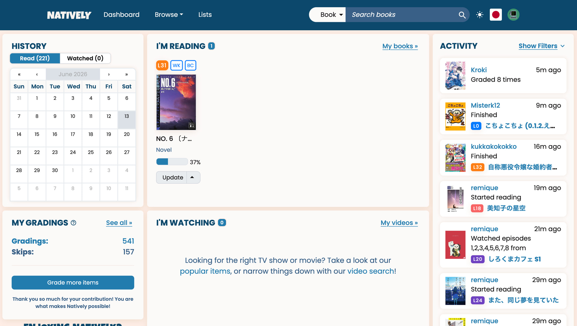
I think this site fulfills a few different goals and for different users different ones; for me learnnatively is the most fun in discovering new media to get into. The activity feed (on desktop) is now very small, but for me it was the main thing I used on the dashboard. I don’t really care for tracking my reading or immersion as much, but I do use it a lot for discovering new media. The discovery part now feels a way harder, especially since there isn’t a way to access to activity feed in a way that makes it a bit bigger? (Or I haven’t found it) Like I want to clearly see covers, titles, who is reading/watching (as I do recognize some names) and so on. Now when I open the new dashboard my eyes are completely glued to a small column on the right which feels pretty cumbersome, since I don’t use much else at the dashboard. Nowadays I usually don’t really track reading percentages or pages read, so I only set a book as finished every once in a while, so even the tracking my watching/reading feels oversized for my specific needs.
Some random comments on the UI as well…
I haven’t seen this way to do a toggle before and I think it’s a cool idea, but the contrast here is really low. I wonder if it would make sense to maybe switch to a style that could be made more contrast rich. What you definitely should change though with the current toggle is the focus, I can’t see it at all. There also seems to be no focus on the “Update” button when tabbing. Also, I can focus through the entire calendar but can’t really interact with it inside the keyboard at all. The “plus” icon inside the TV shows also isn’t focus-able. Otherwise you are doing very well on focus management, so I think improving the remaining focus states wouldn’t be a big effort and improving the experience for everyone who uses assistance in browsing websites. Maybe just try tabbing through the site every once in a while so you can catch those small things too.
The global activity list has 25 entries to start with and gets 50 more entries each time you press the load more button (at least on my iPad). So nothing has changed as soon as you actually start browsing the list, I‘d say.
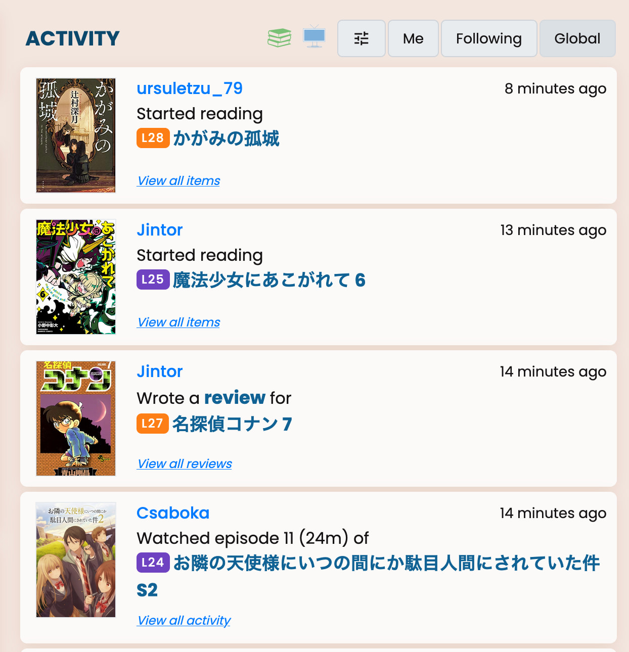
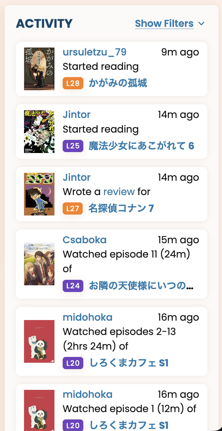
I mean the size, not the amount. Maybe it does look the same size on bigger screens, but on my laptop it is now very hard to read/see. Titles get cut off, covers are not really big enough for me to see much, etc…
Old
vs new
I see the names also have no longer a second line, if too long for one line.
In this comparison it is maybe even more obvious how much stuff is now cut, as before all those titles fit comfortably on my device and now they are all cut off.
If your only use case is using the activity feed, it is a bit of a downgrade, although I want to stress that I think for most users this new dashboard is an improvement, all in all. Just wanted to share my perspective. But I have no idea how many users like me exist anyway. (Small desktop screen, very interested in activity, …)
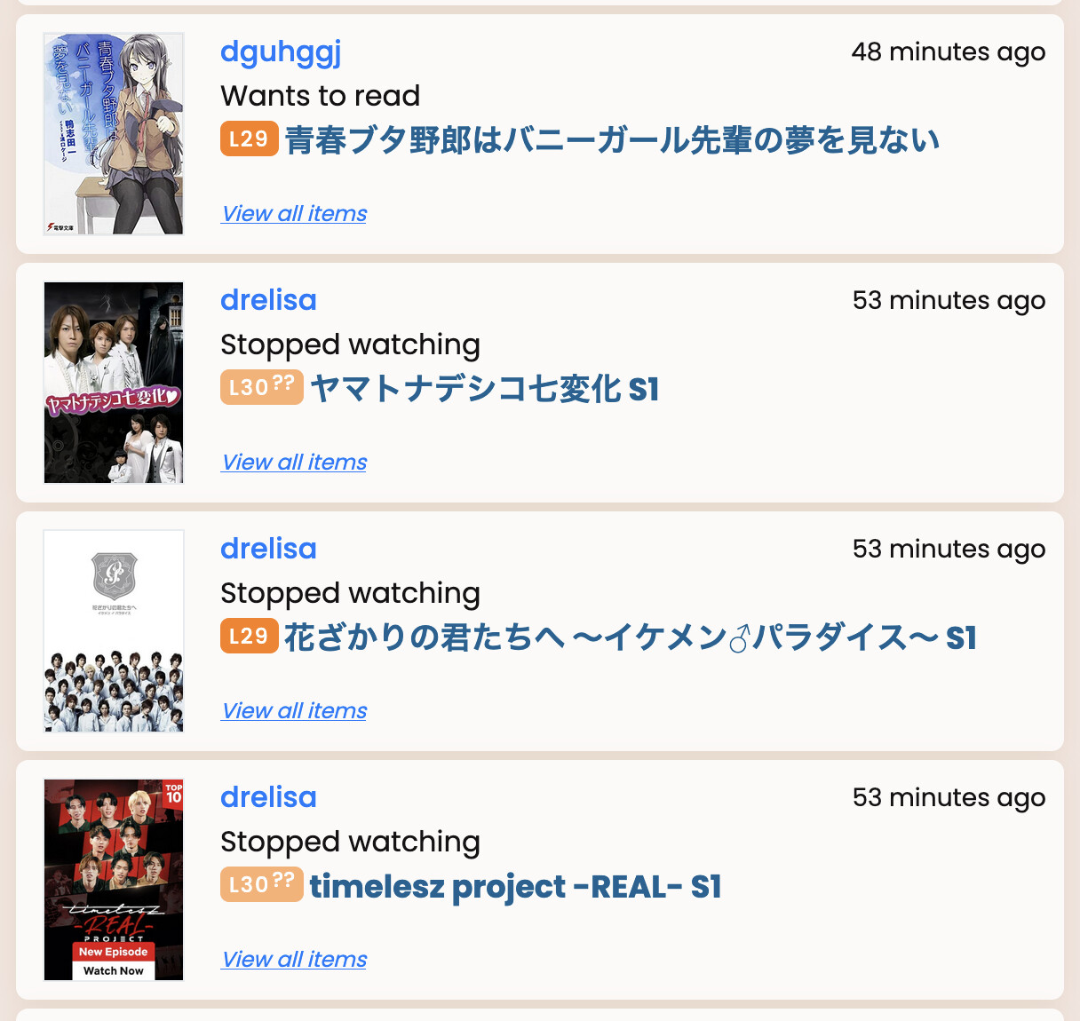
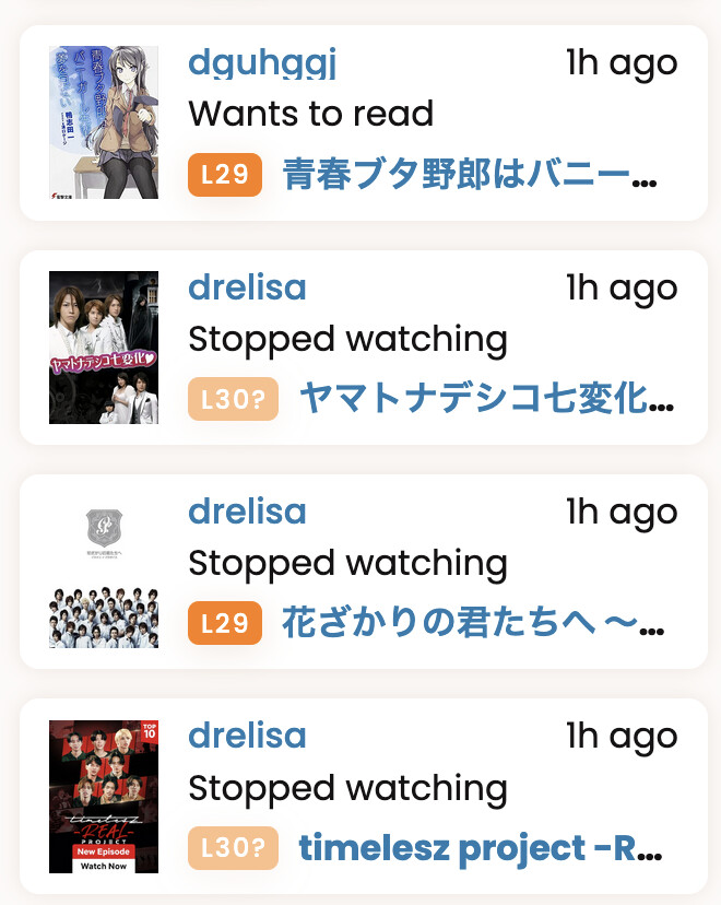
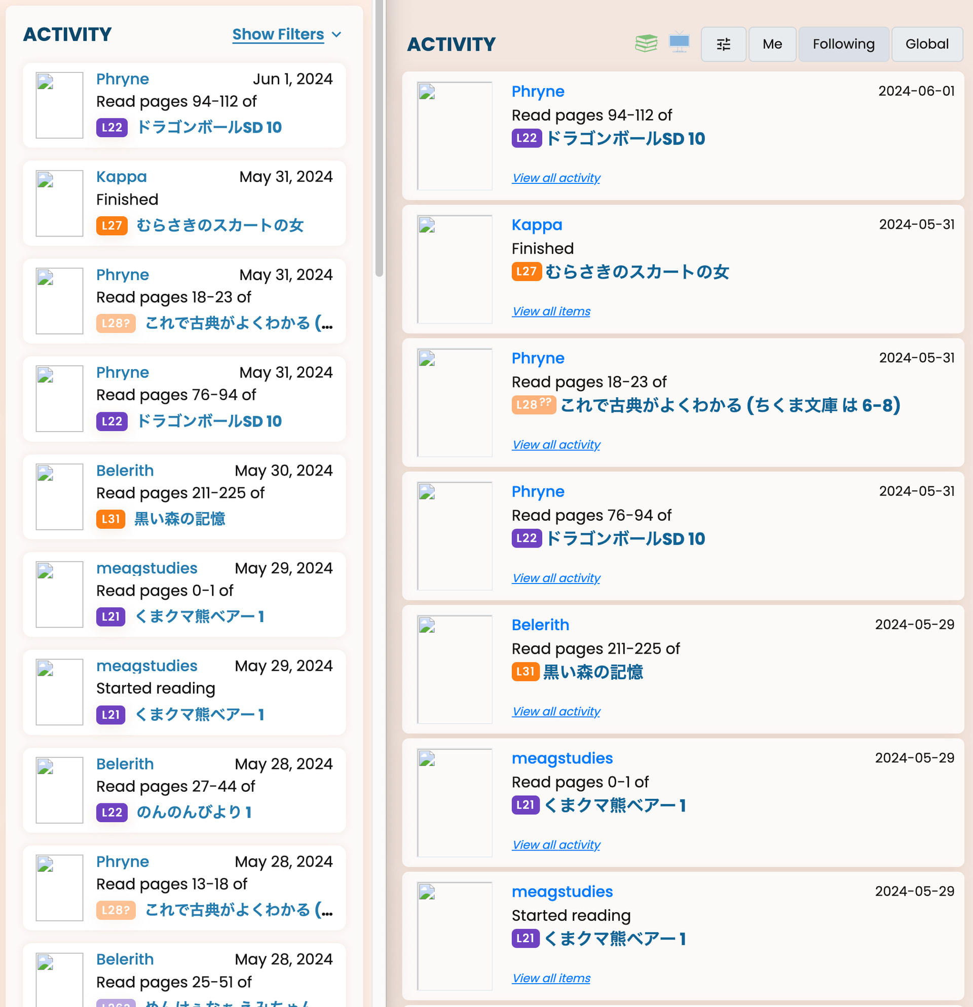
It feels like that, right? But if you put them side by side (sorry for the broken images):
you can see that the font of the black text is the same, the font of the date is even larger now (and hopefully more readable), admittedly the font for the username and book title is a tad smaller though. And overall you get to see much more (in terms of number of entries) on the same screen.
To mitigate the smaller pictures and shorter titles, we put the pictures into the hover as well, so you can enjoy the art and book information by hovering over the small images. We felt that it is quite a good compromise. 
The only thing I can come up with right now is to use the browser zoom until you get into 2-column mode? or reduce the window width. Would that help?
One thing we could think about is a whole page just for the activities, would that help? No promises yet, and it won’t happen soon, but I can put it on our list.
Both of your suggestions would work for me personally, although the first (zooming in to get into 2-column mode) would only be accessible if you know about it – if someone else feels like me there is not a high chance they would figure that out on their own, I think. And I guess the font would probably then also be uncomfortably big? Furthermore, if I do it now, I am still unhappy with the size of the covers in the zoomed in (I assume) mobile version.
I don’t really want more information on less space, I have no issue with scrolling. So in the big picture I get why it is an improvement, but for me not really.
FWIW I also think the activity feed (on desktop) feels a bit small.
I’m sure it’s highly subjective as each person’s interested in different things, but the activity feed is probably the most interesting thing on the homepage for me too.
My view:
Also minor thing (not sure if already brought up):
letters q,g,y etc. are getting cut off from people’s username’s in the activity feed (possibly elsewhere but I haven’t spotted)
E.g.
That might be a good solution! There could be the small activity column on the dashboard, then you could click through to a large activity page with more space and information.
Oh, I would love this as well! I too think the current activity column on the new dashboard is a bit small, but if there’s a dedicated page, the current size makes sense.
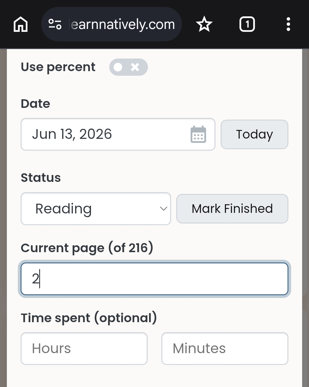
Somehow I have issues with entering the page number. I cannot delete the 2 in the screenshot (it was twenty something before).
I did notice that, for a fresh book, I was unable to delete the 0 that prepopulates before you add in any page numbers as well.
I noticed this too and wasn’t sure if it was too picky to complain about. Looks like with the new system you have to highlight the number and type in a new one, as opposed to hitting backspace.
Nah, I would say this qualifies as a legitimate UI issue; being able to backspace a number is standard behavior everywhere else online.
@Pashmina @soggyboy @eefara You are right, this is a bug! I am aware but haven’t gotten around to fixing it. Will do so today or tomorrow 
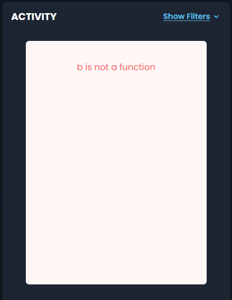
Oh that one is interesting! I will look into it, thanks for reporting!