This is due to the navbar still being part of the “old way”, so the data flow is a bit wonky until everything is using the “new way”. We’re going to release a patch soon though that should make things more seamless while we continue to work on this.
This is in the works as well! Good idea about the toggle.
my only gripe at the moment is the “I’m watching”.
I don’t use natively for video stuff…so it’s just a lot of wasted real estate.
Would be nice to have the option to turn this off or even the possibility for users who use natively more for watching than reading to be able to preferentially turn one or both off and/or reorder which one they might want to see first…
nit picky stuff but … eh figured i’d throw it out there…
TY!!!
edit…also if we have a lot of books - maybe an option to display 2 rows of now reading (instead of one)… less scrolly…
haven’t used the new DB much yet but also noticed having to click filters
personally hate having all the extra clicks… I’m someone that hates when something that used to be a single click becomes 2 or 3 or 4… ugh microslop office…
but suggestion to add a couple of single click buttons (or toggle) in this area:
could be a favorite setting or a fav filter or something like that…or just shortcuts?..
Personally I only use the “me” and “following” on the “reading” but having to click to open the filter x1 then click me x2 and then click close x3 and rinse repeat to switch between the two is annoying…
yeah I know it’s nit picky (personal preferences but something to consider)…
edit… oh I just realized there is no “I’m Finished Button” on the new DB … the one that automatically puts the book at the end w/o having to type a page number…
ahhh I see just flipping it to finished does it… but seems like one extra click has been added… one to click down and one to click finished then save … vs finished and save… (more added clicks which aren’t necessary in the current db)
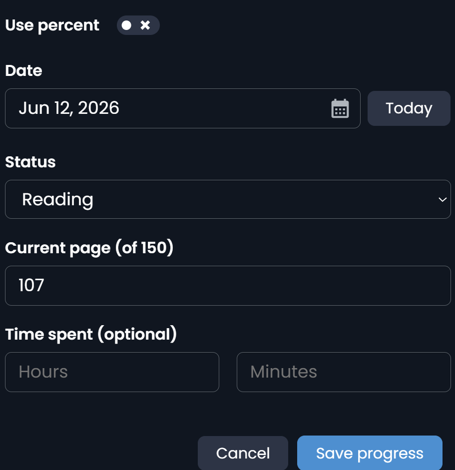
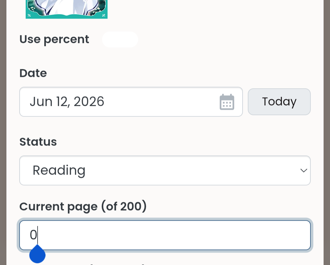
The percents/page current value “0” is not a sample value, I needed to actually delete it to put a number in (I think it’s the same in the current dash version, but it’d be nice to fix as well if possible)
Playing with the old dialog to check its behaviour, it doesn’t autoclose – the “I’m finished” link puts the page count to max and sets the book state to finished, but the dialog is still active so you can cancel it or change your mind. So the difference is that in the new dialog you have to click on the reading status widget and then click again to select “finished”. That’s pretty similar, but to me feels just a touch less obvious (personally I didn’t expect that to also update the page count, unlike the explicit “I’m finished” link: I tend to assume controls inside a dialog don’t affect each other) and it’s two clicks rather than one.
The new version of the dialog does correctly remember the page count if you switch to “finished” and then back to “reading”; the old dialog has a bug/issue where it leaves the page count at max even when you select “still reading”.
OK question to everybody: How should the scrolling work if we have two rows? Specifically: What should be displayed in the second row (a) when it is in leftmost position, and (b) when it is scrolled a few items to the right? I cannot come up with an intuitive way of having a sideways scroll in two rows, the only intuitive option I see is scrolling downwards, which might conflict with downward scrolling of the whole page on mobile…
On the other hand, previously you had to set the filters every single time, and now they remember what you set last time (I know, not an excuse though)
You are not forced to close though! If you have the space you can leave the filter thing open all the time.
We are planning to make the filtering more flexible at some point. Would you want to see these two together in one stream? Or do you prefer to have them as separate options?
But it actually is at 0 percent initially, no? I am not sure whether 0 percent would justify a special treatment as it’s just as legitimate a value as, say, 27. Hmmm… I’ll see if I can improve this.
This irked me too (But now I notice I only changed it on the update dialog, not on the basic info dialog Will fix!)
honestly don’t know… was just a suggestion… downwards would be the most logical… (at least for me)
especially if no videos and then used that space for currently reading, then would make perfect sense…
as far as design layout/mobile… no clue… was a design consideration/thought, not a demand
maybe i should make it a demand
h8 the extra clicks (yeah I’m old and grumpy but i h8 all the xtra clicky crap in general… gonna yell at a cloud about it … don’t get my started on the morons at microslop changing keyboard shortcuts in ms office that have been the same for 20+ years because someone thinks it’s better… then you change them back after having to search to figure out where it’s buried only to have them change back to some new thing again with another $#@$#@ update )
I don’t want to leave the filter open… (laptop screen) I personally like simple buttons next to each other right now on the existing DB…and yes I realize that the entire db design must be centered around my needs and only my needs
Seriously though really do appreciate all the care and considering going into the user experience for everyone… it’s so nice to see natively getting even better!!!
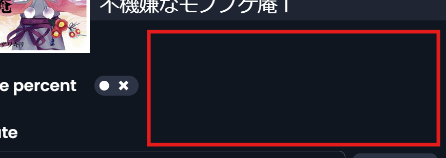
Last night realized there is a lot of room for a button for “I’m Finished” here:
I’m on a laptop so not sure about what that does to your mobile layout but lots of room in that marked red square area on the update page. Could even add a “Stopped reading” button but not sure that would get used enough to warrant a button…
hmm… never thought about it this way… I click back and forth between them new just because it’s required to see my own vs others…
I like this plan if these two are together (an option w/o global) … I don’t want to see the global feed…but together I’d probably never switch the filters ever!
I just pushed a change that might be a fix for the issue. If somebody with an Android device could please try once more?
Update:
The reading and watching sessions are now automatically displayed on the dashboard calendars
Improved the dark mode handling. I still see a short flash when I reload the page, but switching between the new dashboard and the rest of Natively now works smoothly for me. Please let me know if you find other issues!
Fixed the display for the review entries in the Activities feed
A handful of fixes and improvements around the dialogs - more still to come
Oh, that’s great to hear! I must confess I only fixed it in the new dashboard .
But when it works, then we can extend this to the other parts of the system, I think.
Android Firefox has a toggle under Settings → Accessibility that lets you set “allow pinch zoom even on sites that prevent this gesture”. I habitually have this set, but as a test I turned it off, and the old dashboard does then no longer let you zoom that way.
Whatever else you allow, I want to be able to just see my own activity. I will occasionally look at the other views, but most of the time I just want to see my activity.





 (I know, not an excuse though)
 I am not sure whether 0 percent would justify a special treatment as it’s just as legitimate a value as, say, 27. Hmmm… I’ll see if I can improve this.
 (But now I notice I only changed it on the update dialog, not on the basic info dialog
 Will fix!)


 maybe i should make it a demand


 I must confess I only fixed it in the new dashboard
 .