The system could have quietly rounded the value, but it complains. I do not like such behaviour, reminds me too much of Julia, the programming language.
3 Likes
Nice! I’m sure you poured tons of work into this and I’m glad to see it paying off! 
One minor thing that’s more a design item than a usability issue - is it possible to move this bit in between the calendar and the gradings sections?
And also possibly add a line about ‘certain book sellers on our site are affiliates, buying using these links helps Natively out’ (or something like that, someone can probably wordsmith better than me  ). The reason I ask for this is I’ve had conversations with a handful of people over the years who had no idea Natively got any money due to affiliate programs and thus never considered clicking through via the book pages, despite using Amazon/etc.
8 Likes
Just had a quick look on mobile only.
I’m sure I could get used to it with time, but something I’ve always appreciated about LN is how easy it is to update your reading for the day from the home screen without having to do any menu navigation, so I either fall on the side of agreeing with Brandon here re: the homepage being scrollable with tabs for quick jumping, or keeping the week calendar for quick updates on the main page.
Making it scrollable would hopefully solve a minor issue I see for me and my small hands where I can only comfortably reach about halfway up the full month calendar on the stats tab (Doubly so as the boxes for the month calendar are smaller than the week calendar too!)
I never really used the month calendar before fwiw, and have always seen this as the “crap, I forgot to log for a month, time to go update a bunch” calendar.
My preference would be keeping the old small calendar (the one that’s a line with about 5 days on it) on the main page for keeping the ease of daily updating that I’ve always loved LN for!
Seconding Quick Stats under stats too - hopefully with the ability to choose a year one day instead of just 2024 or the current year!
Nitpicking out of love, I promise…!
6 Likes
Again, thanks so much to everybody for posting all these findings and suggestions! I would like to respond to a few of your comments. All others we will either address immediately, or we will defer them for a bit (I will let you know which ones) because in some cases we would like to introduce a larger change which needs more reflection and/or a discussion with y’all, so we consider them out of scope for the time being.
We’ve decided to make the three dialogs more focused on doing one thing each (and doing it well, hopfeully): The “Basic Info” dialog is for editing general book information, the “Update” dialog is for capturing your media consumption, and the “Data Manager” is for fine-tuning and fiddling with your consumption sessions. Therefore, the “change total pages” option is now only available in the “Basic Info” dialog (where it was all the time). I hope you would want to change the total pages of the same book only once (or maybe twice) and as such it is hopefully acceptable to go to the “Basic Info” dialog to do this?
I fully agree! For the time being I implemented the same behaviour as in the old dashboard. My plan is to completely overhaul the tracking, but this can only be done once the majority of the site is revamped. Therefore I need to ask for your patience for a bit longer.
This behaviour is also present on the old dashboard, no? Thank you for bringing it to our attention, we will fix!
Ah, maybe we have a different perception of what “recent” implies? For me, “this month” is really recent  Also, previously one could already load more activities, or see more books that are in “in reading” state but have not been touched very recently, by scrolling. And now you can also go back in your watching and reading history. Does that feel so inconsistent for you?
Oh, could you please explain one thing to me? Why would you want the “tomorrow” field in that widget anyway? When I redid the widget, I thought that was a bug  but now that you’re explicitly mentioning it, it seems that you want this field?
I take this to mean that the highlight on “today” is not visible enough? We will think about how to improve the situation, thanks for the feedback!
There was a little discussion in the “Frontend Development Roadmap” a while ago:
We thought it’s a great idea (and we both like it much better than the previous one tbh) so here it is…
We tried hard but we could not reproduce this. Do you maybe still remember what you did to get to that state, and is it reproducible for you?
There is already a feature request around this, so we are definitely planning to have something like that going forward, but we would like to defer it for now.
Great suggestions! I am sure we can make the dashboard much better still, but I’d like to have that discussion a bit later.
Updates:
- It seems that the user profile information did not load for everybody who had their profile visibility set to “semi” or “private”.
 The effect was that parts of the dashboard did not load properly, including the Activity filters and stuff. Please reload and try again!
 - Gradings: Mathew fixed a bug where the gradings were not properly counted. Please have a look again, the numbers on the old and new dashboards should now match. (Also, is the “grade more” button now displayed correctly, or is that still off?)
- Font size on Activity: This should now be more readable. @eefara does this fix your squinting issue, or are there still spots where you would like the font to be larger?
11 Likes
Works perfectly now!
2 Likes
I guess I’ll get used to it, but to give you an idea of where I’m coming from, the only two things I ever need to update are my current page count and the total page count. I don’t think I even knew the “basic info” dialog existed – I was vaguely aware there was a “full editing of reading session data” interface but I’ve maybe had to use that once. And usually the time when I notice the total page count is wrong for the edition I’m reading is right when I’m doing an “I just read some more pages” update, so being able to fix it in the same dialog is simple. With the new setup I’ll need to dismiss this dialog box and go find the other one, so for me the site is now more awkward to use and I need to know about and use more parts of it than I did before.
3 Likes
More recent than the past few days??
I mean it depends on the user whether they keep something they haven’t read for a long time in “currently reading”. Kind of touches on the issue of not having an “on hold” option (Product Request - Option to set book as "On hold"), so I’m guessing people will have things they aren’t currently reading since the other options aren’t great (“stopped” prompting you to grade, etc).
You can already do this in the activity section of your profile, why not just link the current 4-day display to that? I doubt many users check out which days they marked read/watched months or years ago - stats would be more useful for that information, anyway.
You realise that with the monthly calendar, especially at the start of the month, you don’t just show “tomorrow”, but several weeks into the future, right? Why would I want that?
You assumed “tomorrow” was a bug but thought adding weeks into the future was an improvement? 
I could do without “tomorrow” in the current set-up anyway.
So a slight improvement to the worse option… 
That’s literally two users. And the original idea:
This, or a simple link to the activity page, would have been better. 
You didn’t address this, but it’s another example of sacrificing ease/usability for… well, nothing. 
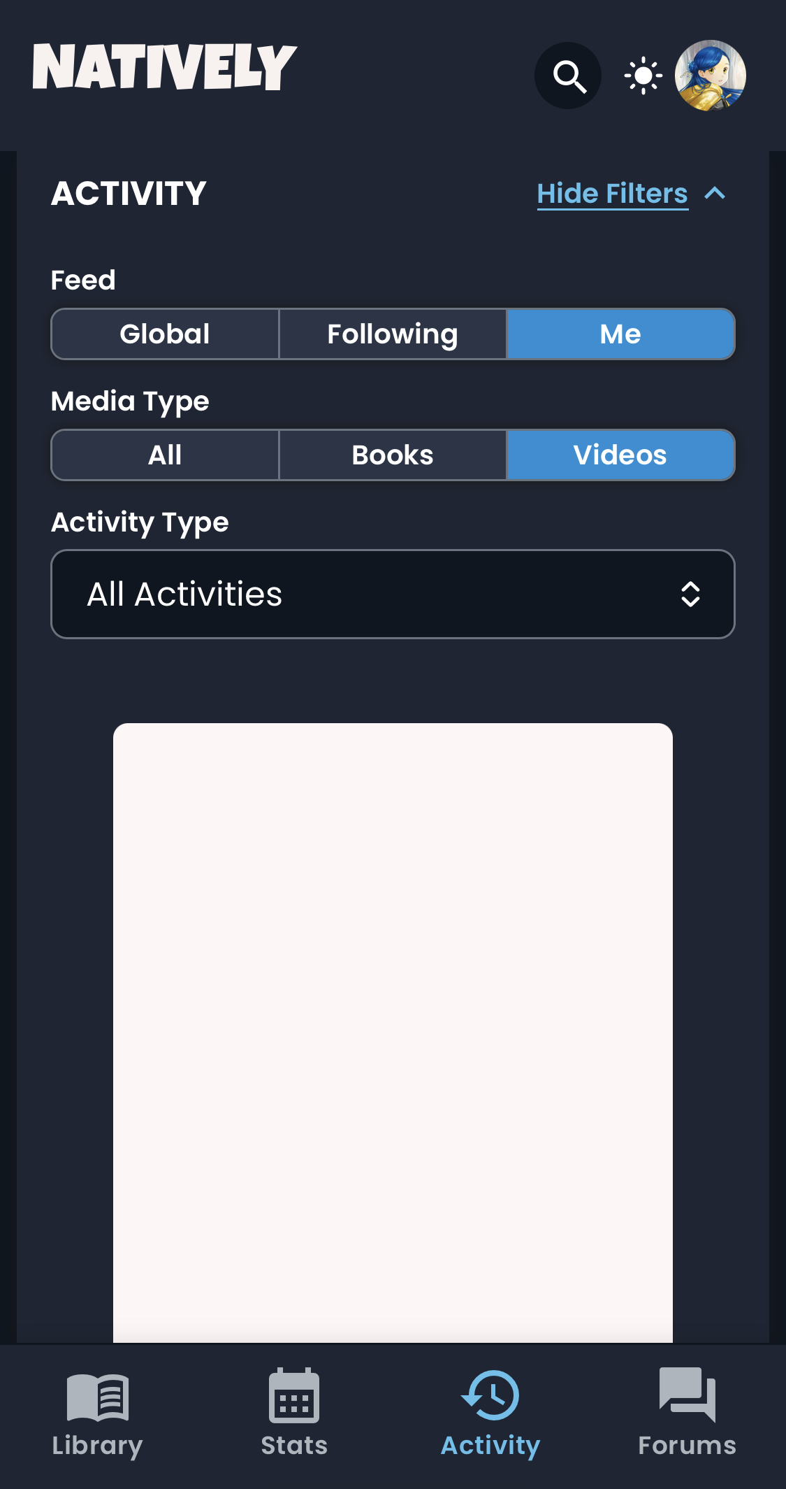
The new size is much better, thank you! I will say I’m more partial to larger book/video images being shown in the Activity Feed because I like all the pretty art, but that’s purely a personal preference and not any particular bug that needs to be brought up now, I think.
(Edit: I do notice there seems to be a good bit of extra room on the hover pop-up for Activity Feed items; perhaps image and font could be increased a little bit there as well? I really like the change with the pop-ups and having cover art/genre tags instead of the book summary, by the way. Feels cleaner and less visually overwhelming.)
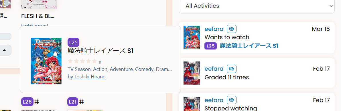
(Speaking of larger art, I wonder how interesting it would be if there was an Activity feed view that was just a grid of cover arts, and you could hover over each cover for the actual user update? That might be a little too much, granted, but I do love me a grid layout.)
2 Likes
I love the look of the new dashboard. we can see more things at once, which is really nice. And I particularly like the new way of filtering activity.
A few small things. With the dark mode, I need to click twice for it to work, and if I switch to a different language I need to activate dark mode again. It would also be nice to have the part that talks about the amazon affiliate links more visible imo, maybe just below the patreon/kofi links? I did like having a link directly to my profile, this adds another step, but then again I’m not sure where it would go with the current set-up
And on another note, someone has already mentionned this but I would love it if logging some pages read automatically marked that day as having read something. With maybe a toggl somewhere to choose whether or not we want that functionality, because I can see how it could be annoying for those who don’t log the day off.
5 Likes
I love the new Dashboard!! Thanks for all the hard work. Some thoughts and requests:
Tabbed Nav
I love the tabbed nav, but also agree with other that having that initial tab contain all the content under it is beneficial. Personally I would still keep the tabbed nav, but have that first tab also contain all the content, for people who prefer to scroll.
Please Fix
We are unable to to pinch zoom on mobile. It’s really frustrating (especially on the Activity page) and there’s no benefit from disallowing. Please enable this 
A bit wonky
If you’ve scrolled down, and then click a tab, it will maintain the same vertical position. So clicking Stats after scrolling through dashboard resulted in:
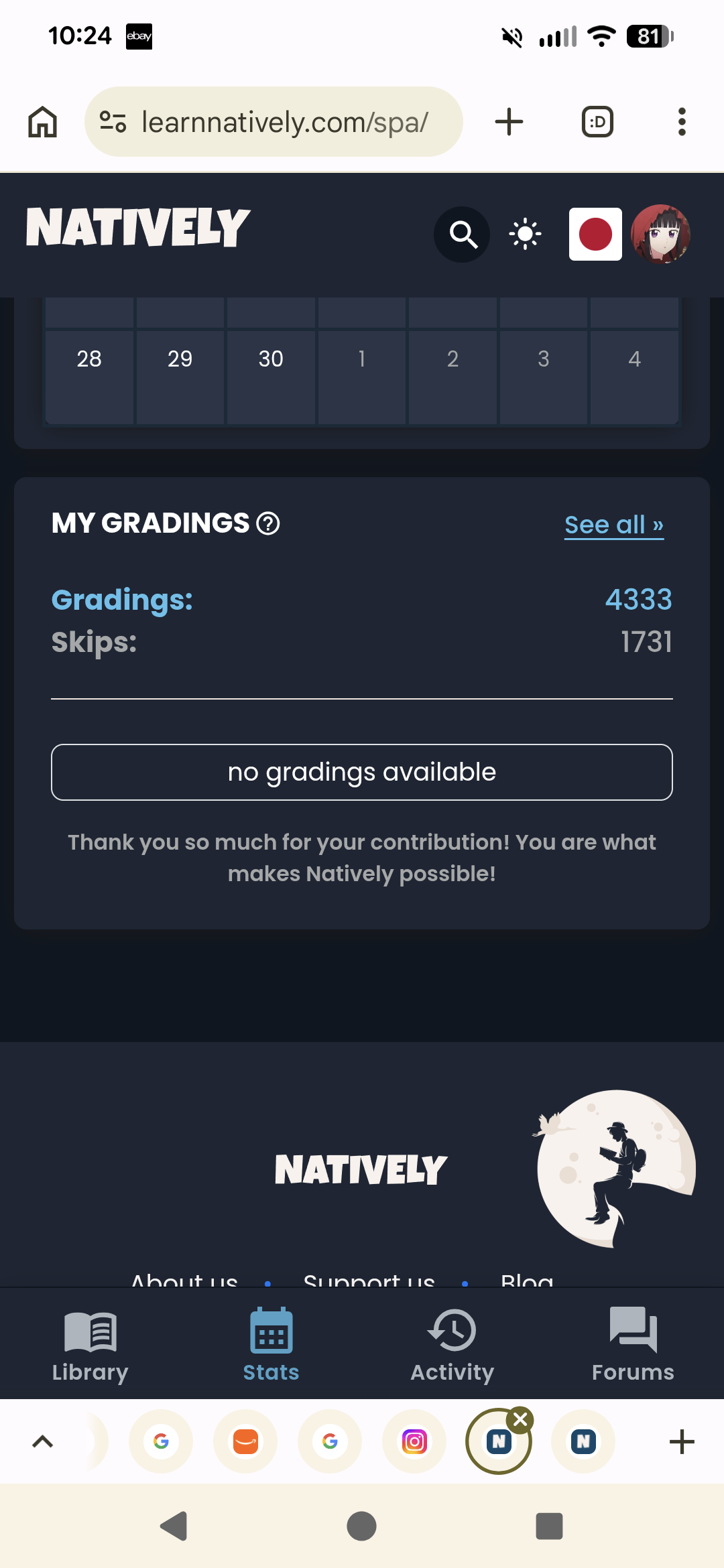
Also, I wonder if it might make sense to incorporate some of the bar graphs or stuff from the profile stats - as that’s what the word Stats implies to me
I would tweak
Dashboard: Update button in Dark mode - the original grey is a much better color imo
Similarly I prefer the look of the original progress bars too. I find flat design pretty frustrating tbh - things blend in too much
I guess the icon next to the video ep counts is “currently airing”, but that wasn’t intuitive from the icon. Not a huge deal
“My Books” and “My Videos” - I would love to see the font size just slightly bigger (1-2px). Just my preference
Activity: Items in the Activity tab are rather crowded. I would increase the line height slightly (I realize that might make the thumbnail size a little weird)
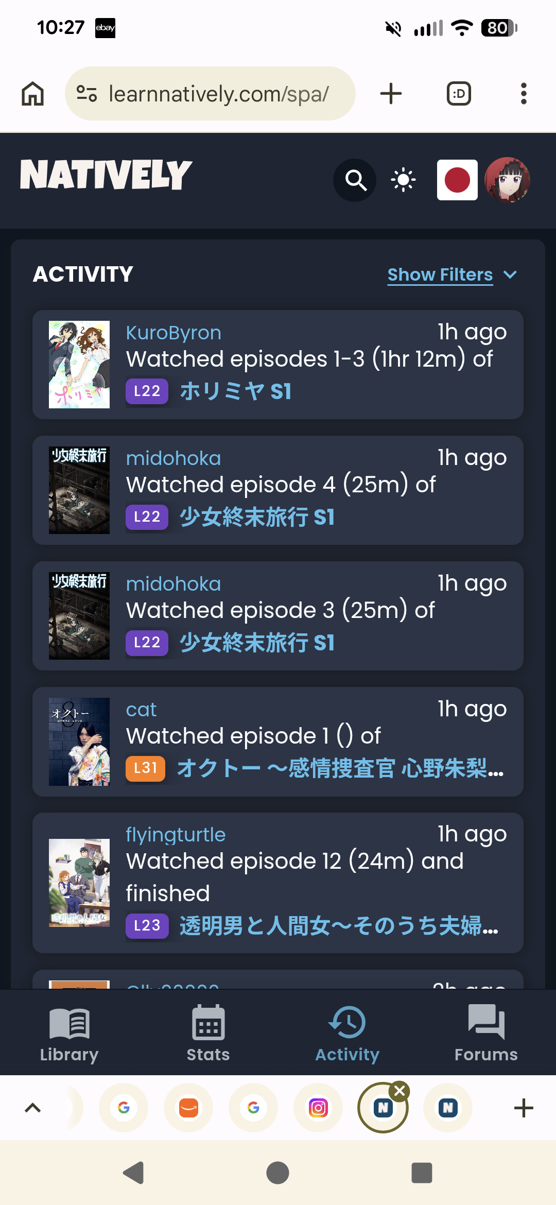
Also I would remove the duration from the strings. The text. Ex: Watched episodes 1-3 (1hr 12m) of would become Watched episodes 1-3 of [num episodes]. The duration of episodes is irrelevant clutter to me.
In any case, thank you for all the hard work. This is a real improvement!
7 Likes
The Basic Info dialog (on my desktop screen at least) for a video seems just slightly misaligned:
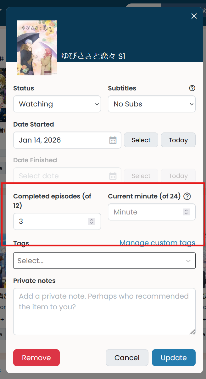
And is the Select button needed when you can already click on the Date Started field to open up a calendar select?
4 Likes
The “update” dialog has lost the “I’m finished” button to record the remaining pages and mark the book finished. The old dialog lets you do this with a single click.
4 Likes
Hmmm.
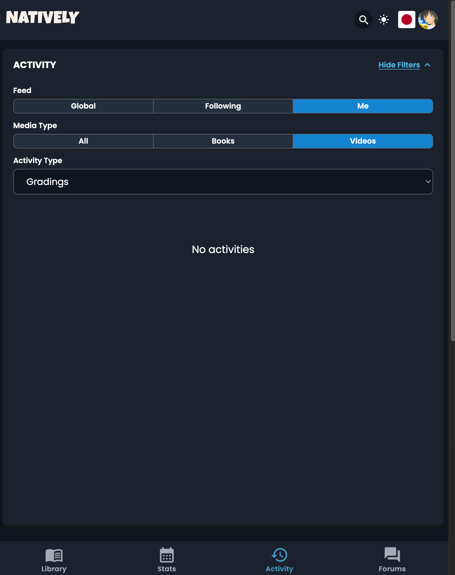
Granted, that’s me in Chrome on desktop, but I just tried and it’s the same on iPhone in Safari. I’d hope that it doesn’t differ in crazy ways between browsers 
I will hopefully get around to doing some dark mode handling improvements tomorrow. Will get back to you after that!
1 Like
Oop, I guess it’s because the modal is too narrow and the text goes to the next line. Will see what can be done about that.
You can also select just a year or just a month, so there’s not a way to know if you mean to input the month/year as the final date, or if you mean to click into it to select a narrower scope. We’d like to make this discoverable…
2 Likes
I’m on Firefox and also not able to reproduce still, but will keep trying. I do wonder if it’s because of the issues with dark mode persistence somehow, but not sure how that would happen here.
2 Likes
This was a conscious choice as we tried to reduce “side-effects” of various actions, which allows things to be a bit more configurable. In particular, the old behavior would assume that you finished the book that day. Now, if you select the finished status, it will still auto-fill the pages/percent, but you can also adjust the date and add time spent if you need to instead having the modal close on you.
For me personally this sort of auto-close feels very unexpected, but I recognize it will feel like an extra step if you’re used to the old way. This is maybe another good candidate for changes we’ll want to collect targeted feedback about once we’re a bit further along.
ETA: Maybe a “Finish Now & Close” option would be a compromise option that makes the behaviour more clear?
Noted! I had actually just changed it yesterday as I worried maybe the color was too light, so I tried out a different one for the buttons and the progress bar. I don’t use dark mode most of the time, so I don’t feel I have a good sense of what’s “too light” for people.
We’ve been experimenting with different icons. Very open to suggestions!!
4 Likes
I think it’s a me problem. I’m getting 500 errors.
2 Likes
Aha! This is very helpful, thanks. Will look into why that’s happening.
2 Likes
I also messaged @nikoru about a slight privacy consideration since I didn’t want to post details publicly and already had a message thread with her. Nothing big, just something to think about.
4 Likes