I know it’s been a while since we started working on the Dashboard overhaul - a bit more than 4 months now And we have been very busy behind the scenes. So now, after this long time, we’re eager to hear everybody’s opinions!
That’s why we give the curious souls among you the chance to have a look at it and take it for a ride before we finally put it in production, so that we can hopefully weed out any odd bugs that are still lurking in the cracks
For those of you who wonder what will happen when you click this link:
The beta simply a (hidden) page in the regular Natively website, you can switch in and out of it as you like. Just like you can switch from, say, the “Browse” page to the “Lists” page.
It does not “lock you in” or anything. You can always go back to the normal Dashboard through the links in the navigation bar.
To get to the beta, you need to click the above link or change the URL manually though. There is no visible link on the Natively page for now.
The beta doesn’t set any cookies, but it stores your user settings in the browser’s localstorage (which is the plan going forward). Of course that doesn’t include passwords or anything security related.
Some known caveats:
You might see a few rendering artifacts on load - we will iron these out a bit later
There are some very minor issues regarding the styling in Dark Mode - hopefully @mathew will be able to iron them out tonight!
The navigation bar is still part of the “old” system while the dashboard is part of the “new” system - sometimes they don’t play together perfectly. These issues will be fixed a bit later, but for the public beta, please bear with them. These include:
Dark Mode might not pick up your current settings so you probably need to click it once or twice to get it in sync.
The language toggle is now only in the header - it may be the case that some parts of the screen don’t render in the correct language after you changed languages. Reloading the page should load everything correctly.
The site switches back to light mode when changing the language.
Other than that, everything is supposed to work correctly - so please let @mathew and me know in this thread in case you notice any issues!
What we would especially like you to look out for and report
Of course, we are curious to hear what you like about the new dashboard - we don’t want to accidentally remove stuff that you are fond of!
And naturally, there will be things you don’t like. Please let us know as well! This is our attempt to produce a nice and usable dashboard, but maybe we’re totally off the mark.
Finally, if you find anything that feels weird to you or that doesn’t give the same results as before, we need to know! This especially relates to tracking and session management of your reading and watching activities. If you notice that something is off (e.g. a session not being created although it should, or something not getting updated although you think it should, etc) please leave a comment as well. (We know the session handling is not optimal, and we will work on it later, promise! But that requires a whole different discussion that we would like to have a bit later.)
Have fun with the new dashboard, and we’re looking forward to your comments!
Woohoo!! You both have been working very hard the last few months to get this overhaul, super excited! . And most of the gains are not even the improved UI but the architecture~
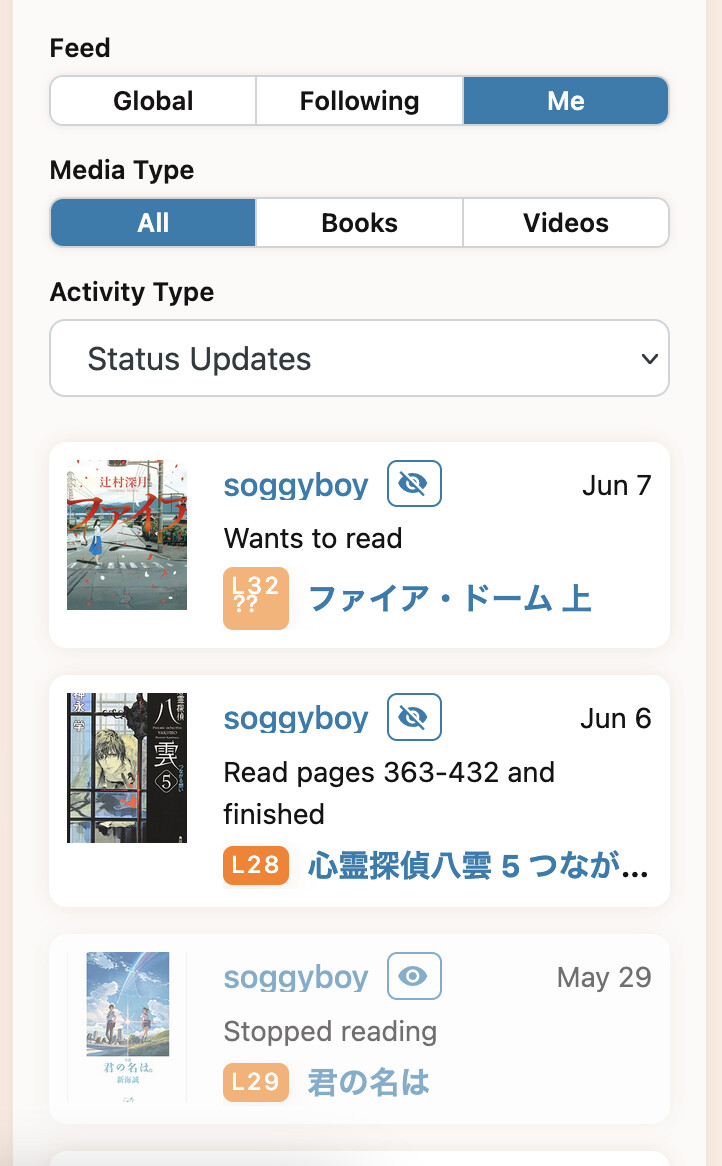
I’ll start off with a minor css tweak to get the ball rolling - the ‘level’ icon for temporary grading wraps the ‘??’ to a new line - probably one for @mathew
..I guess i could fix this too, but i’m getting the ball rolling, right?
Edit: Oh one thing I forgot to say too - on mobile, I think rather than tabs, I think it’d be much nicer to have the entire UI scrollable and just have the bottom menu scroll it to the appropriate section. I’m a scroller by nature.
Thanks for doing all this work. I found some glitches and missing things.
If I click „my books“ right to the list of books on the new dashboard, dark mode is preserved, but when I click the Back button of the browser, the dashboard changed back to light mode, though only on the first trial.
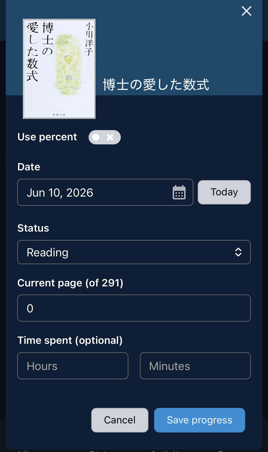
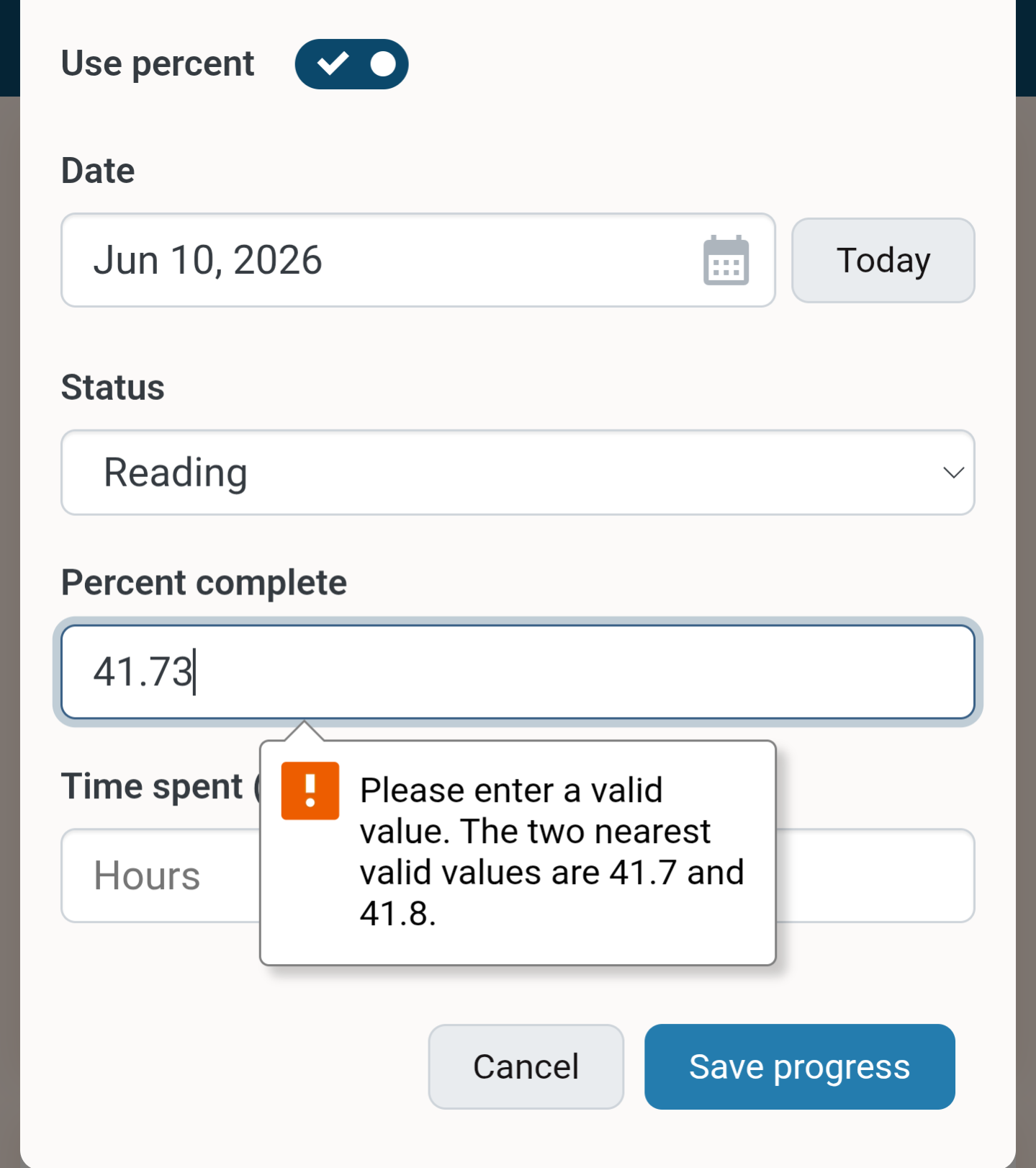
When I click on update for some book, I can no longer change the number of pages, which was comfortable for the many books that have no page number.
If I click on „use percent“ the entry „Percent complete“ keeps the page number (35 of 125 pages). Shouldn’t it change to the actual percentage (25.6 of 100).
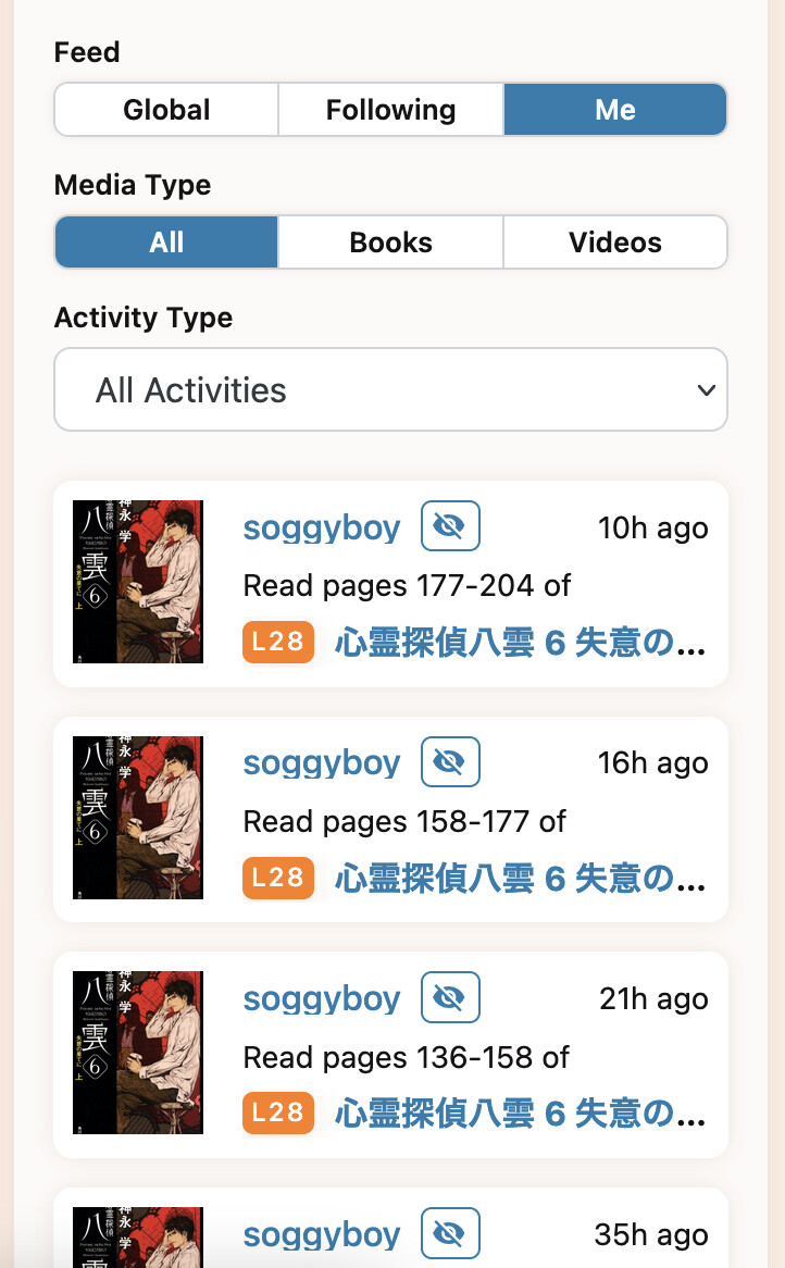
The filters of the activity tab no longer has the activity type „progress updates“, which I use most of the time for my own entries.
Activity list: if I choose the filter settings „me“ and „videos“, „all activities“, I can also see book gradings.
Activity list: if I choose the filter settings „me“ and „books“, „gradings“, I can also see video gradings.
If I click the reload button of the browser, dark mode changes back to light mode.
If I click on my Icon to change e.g. to the forum, the icons on the left have unnecessary understrokes, the understroke for „books“ is even longer than the icon.
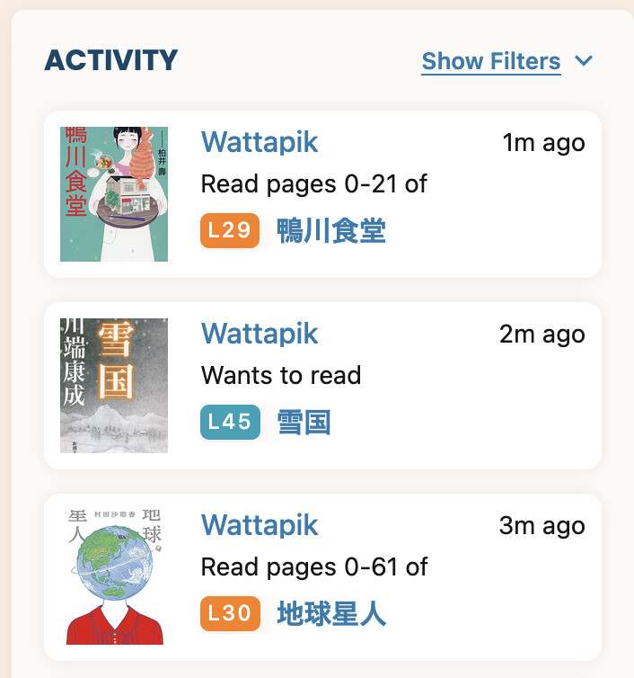
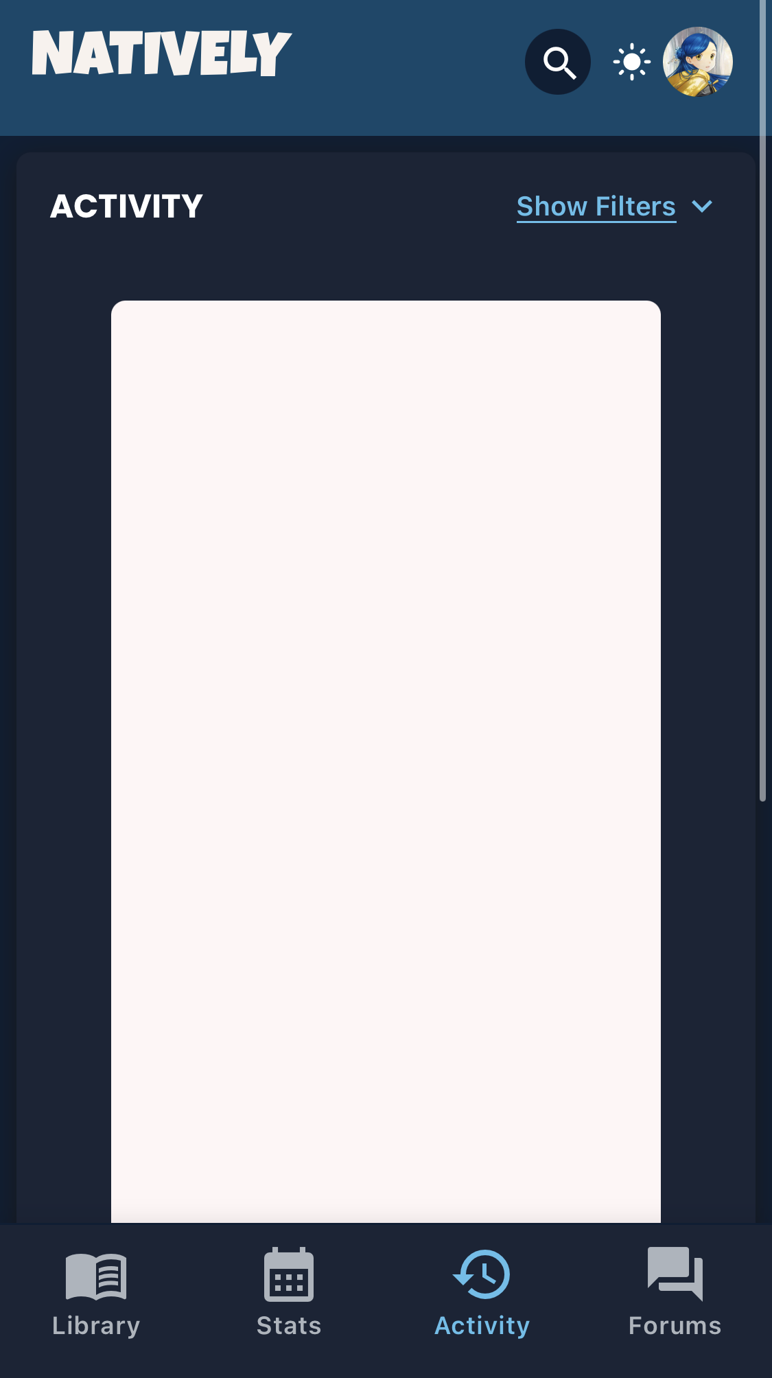
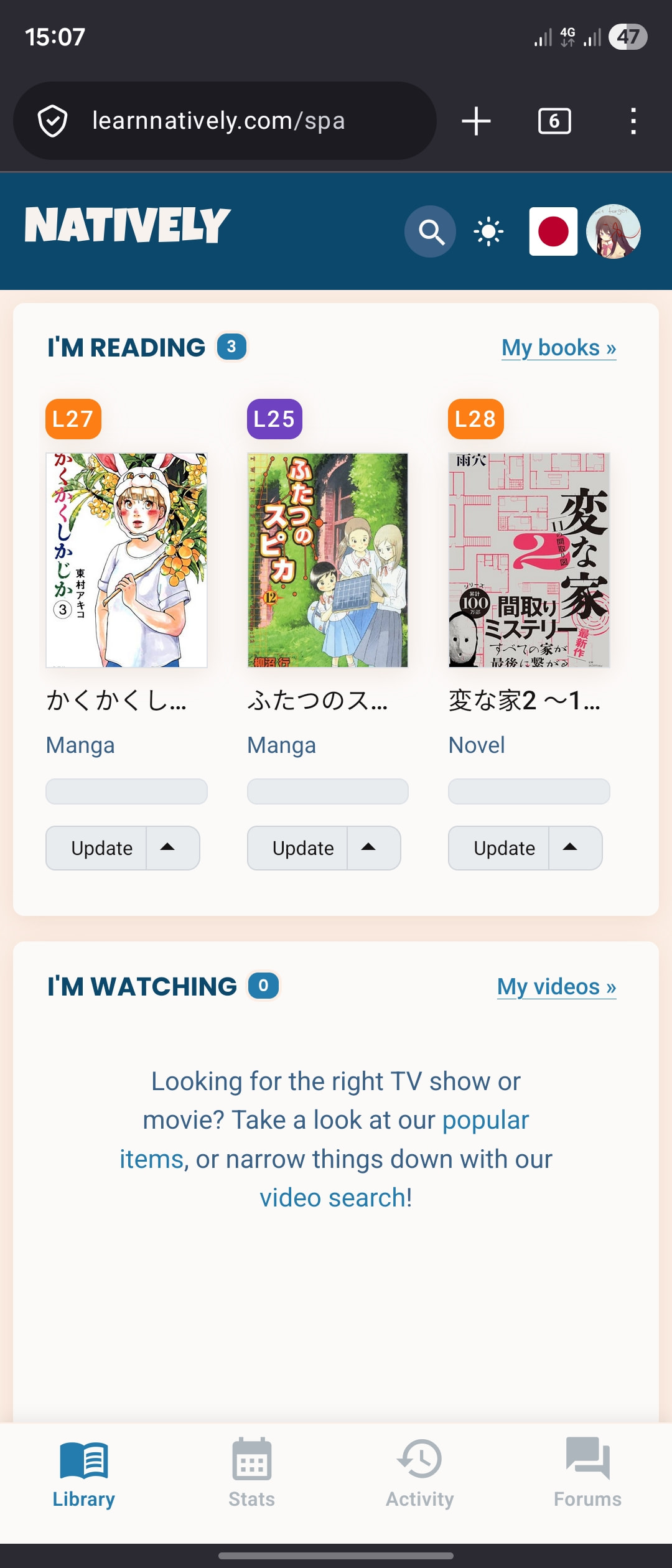
As a front page to the site, the new dashboard seems to be missing a lot of things. On the current page I get multiple panels (account, “I’m reading”, forum stuff, activity feed, etc). On the new dashboard almost all of this has gone and is only accessible by clicking another link in the bar at the bottom. Instead there’s a new “I’m watching” with no contents, which as @polv says the old page suppresses when it’s empty.
Can we have the page continue to have the content the old one does, without needing you to click around to get to it, please?
(I am on a tablet, so I think this is mobile site on a big screen. The bottom nav bar might feel better on a small phone screen, I haven’t looked at that yet.)
The use of space has improved (desktop), but I have a major issue with displaying the history widget.
The dashboard is supposed to be showing the current and most recent items, hence the display of currently reading/watching items rather than the user’s whole library, the most recent forum posts and activities, etc.
The previous “days read/watched” fit nicely into this, as most people will be updating things they have been reading/watching recently - they’re not going to be marking off days read three weeks in the future, so displaying the whole month seems like a huge waste of space. And it was easy to mark today’s days read/watched when they were both visible, but now toggling adds an extra step. It also takes a bit more work to find today in a monthly grid than when it just displayed yesterday/today/tomorrow.
It feels like a step backwards to make that aspect of the dashboard less useable and take up more space, while also not fitting in with the purpose of the rest of the page. What was the logic behind the change?
The update dialog on the new page has lost the ability to edit the total number of pages in the book which the old version has.
The percentage of the way through a book you are is no longer shown, unless you click on the progress bar.
If you’re on the activity feed page, and click through to read a review, hitting the back button takes you back to the dashboard page, not the activity feed.
In the old update dialog, typing a number in the page count box and pressing return closes the dialog. In the new page, return just tabs to the next control in the dialog.
Neat! I haven’t had much of a chance to play around yet and only on mobile, but it seems like a nice refresh at first blush!
The only weirdness I’ve noted so far is that there’s no way to toggle the language if you’ve turned the header button off, but presumeably most people won’t be like me and forget that it was a setting that I toggled years ago before Natively added any of my other languages I don’t see a reason to have a language change button for either the header or the dashboard for single-language users who don’t want it there, but maybe it should be forced to always be accessible in one place or the other for users who have more than one to switch between?
I think people can probably blame me for the empty reading/watching widgets; keeping them visible was a request from me because it’s convenient being able to access My Books directly from the widget instead of going into the menu, esp. right after I’ve finished what I was already reading. I also like that the empty widget has links to the search page, as it feels like an intuitive way to draw people towards content when they have nothing on the go. Maybe there can be a collapse button on the widgets so people who don’t want one or the other can hide them, or a preference users can set for which widgets appear on the dashboard?
Thank you all so much for your feedback! I am busy right now and cannot reply properly, but tonight I will hopefully be able to get together with @mathew so that we can discuss it.
Please keep posting your feedback, we will get back to all your comments later!
Jumping in to say that I fall on the side of liking the new mobile navigation buttons; I’m not a scroller by nature, and I like everything feeling more compact.
I will also say that it feels like everything’s just a little bit harder to read on desktop, I think due to a smaller font. The Activity Feed in particular makes me feel like I need to squint.
As already mentioned, the dimensions of the posters seem a bit off.
I didn’t notice the tabs at first, but personally I like this design. I might recommend promoting the gradings section to the first tab though. It doesn’t really have anything to do with stats.
I will add that the new dark theme is very nice. It’s a significant improvement and I hope to see it applied to the whole site before too long. I do see one issue in the progress popup though: the button next to the “Use percent” text is unreadable.
Activity Feed used to have a filter for Followers only, I definitely would like to have that as the Default to see what’s going on in my circle.
The mobile version tabs are nice and intuitive. For Stats, I would maybe expect some actual Stats, I didn’t consider this before, but it would be nice to have the weekly/monthly/yearly/total quick stats in handy, which are currently a bit hidden under Profile > Activity
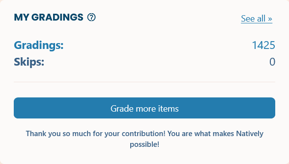
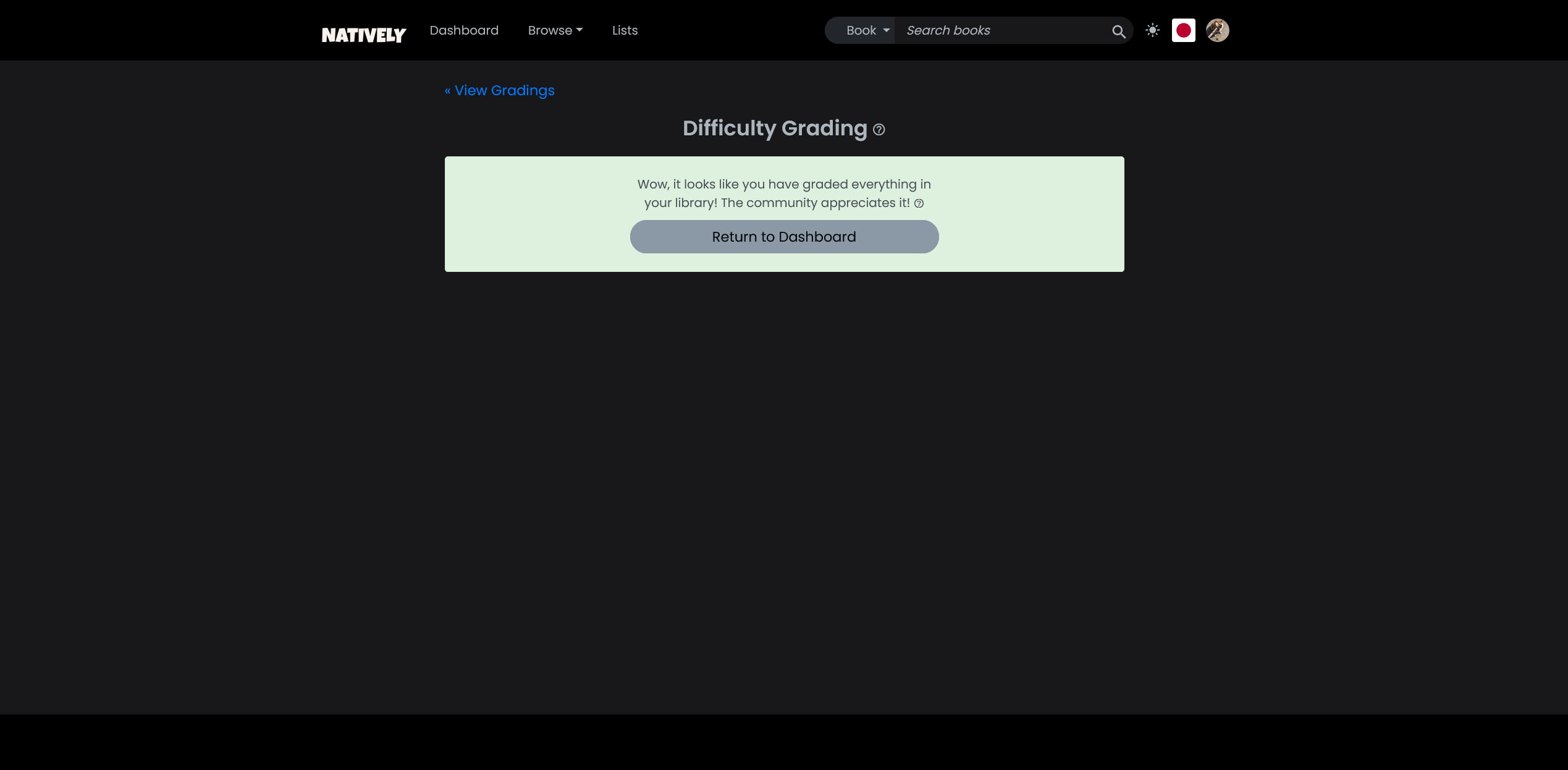
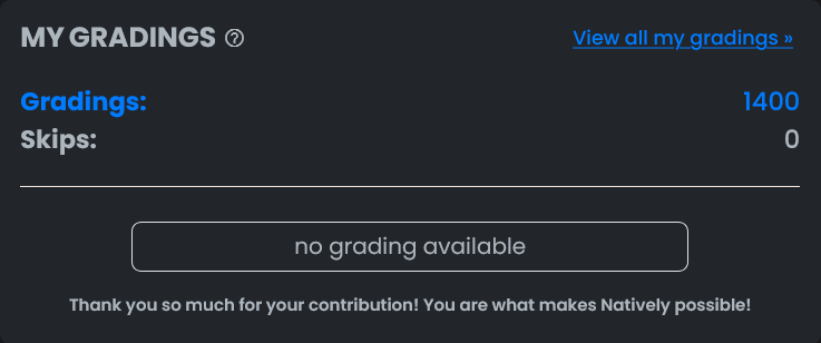
Edit: Now I also noticed that the number of gradings is different in the two versions. What’s that about? 1400 is the number that shows up in my profile as well.
Also, I wonder if the filter types for the activity type could be a checklist format? So we could click multiple types to include in the feed? I’d like to include reviews and status/page updates, but not gradings.
I wish “Stats” tab would have “Quick Stats” (from the activity tab).
It’d be nice to have that page&book&manga counters per calendar months chosen there (say under calendar and above grading? Or below grading? Is grading really Stats?).
 And we have been very busy behind the scenes. So now, after this long time, we’re eager to hear everybody’s opinions!

 . And most of the gains are not even the improved UI but the architecture~


 I don’t see a reason to have a language change button for either the header or the dashboard for single-language users who don’t want it there, but maybe it should be forced to always be accessible in one place or the other for users who have more than one to switch between?